In the current digital world, a Website is an essential part of every business, whether you are operating locally or globally. In order to appear in the first five positions of the Search engine result pages, one needs to fight at different avenues, and the design of the website is one of them.
When it comes to design, the two main prevailing designs are mobile-first and responsive web design. Before diving deep into the present topic, let’s define both terms technically and then see their pros and cons before discussing their differences.
Read | How To Promote Your Business Locally
What is Responsive Web Design?
A responsive website detects the user’s device and adjusts itself as per the device and screen size. It is a design that is suitable for all types of devices like desktops, laptops, tablets, or a smartphone.
So, if you are opening a responsive web design it will appear differently on mobile and tablet, thus enhancing the user experience and showing a presentable and easily navigatable website.
This design is particularly useful for B2B businesses, where most of the visitors are accessing the website from their offices using a desktop. The dropbox is a typical example of a responsive web design.

Pros of Responsive Web Design
Responsive web designs are mostly used where one needs to give detailed information about a product or service. The following are the pros of Responsive web design.
Cost Effectiveness
This design helps to render web pages on all devices, so a single design can help you reach more audiences and users of different devices.
Range of Audience
With the compatibility on multiple devices, the range of your audience will automatically be enhanced. So, you reach more visitors with the same kind of appearance.
Consistent across All devices
This design also makes sure that your content is consistent across all devices and this will also help to enhance the user experience and get a better ranking. This consistency helps you to have the same user experience and brand representation across all devices.
Stacked Information
This design is really good when you have a penalty of information that is necessary to put on the website. This is s typical approach for a B2B business, where you need to mention a lot of technical details for other companies. You may also upload your manuals and guides for different products.
Enhances SEO
SEO is composed of many factors and this design helps you to enhance the SEO by providing good content, related information, call-to-action buttons for better decision-making, stacking information for valuable information, and many more. These all and many others help to enhance your SEO.
Read | Does Changing Hosting Affect SEO?
Cons of Responsive Web Design
Although responsive web works well in different scenarios, it still has some cons, which are presented below.
Mobile Interface
Mobile interfaces require some special treatment for better results. So, a desktop-first design might not go well with the mobile and can cause some optimization issues. These issues might emerge whenever you create a new page on your website. So, you might have to work at the page level to make it mobile-friendly.
Under-Performance
This kind of site might show underperformance in developing and underdeveloped countries, where internet connection is not fast, as it becomes hard to detect the type of device one is using.
Cluttering
Since the same design is used for different screen sizes, users often face cluttering when opening the same site on different devices.
Read | What is the Difference Between Brand Taglines and Slogans
What is Mobile First Design?
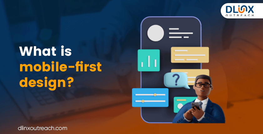
The mobile-first design is a proactive approach, where a website is designed keeping mobile-friendliness in mind. This helps to get a better user experience for mobile users. Since 2015 when Google started considering mobile-friendliness in their ranking, this design is more famous among developers.
So, you would get a better ranking if your website is mobile-friendly and will get penalized if it behaves weirdly on smartphones. A mobile-first will also work equally well on desktops and other devices.
More than half of the traffic on the website is coming from mobile users and this is not stopping here, as the number is increasing rapidly. Stats suggest that back in 2012, this number was merely approximately 10%, and now already reached more than 50% person. This shows how important it is to make a website more mobile-friendly.
The mentality of mobile users is different from desktop users, as the former want only the most important information stacked together for easy decision-making.
So, a mobile-friendly design should have the necessary information so that users can scan it easily.. Aliexpress is a typical example of a mobile-first web design, as shown in the figure below.

Pros of Mobile First Design
Most people prefer to use mobiles, as it is handy and easily accessible. So, your website must be compatible with the mobile. The following are the pros of mobile-first design.
High Ranking
As mentioned before, Google gives high value to the mobile-friendliness of a website. Its crawlers check the features like layout, navigation and mobile readability and if found perfect, then rate it high in the search engine result pages.
High Traffic.
High ranking means high traffic and high traffic means high business. So, a mobile-compatible design will bring loads of traffic. A study suggests that approximately 60% of people will not recommend a website that is not mobile-friendly. So, if you want your business to be shared with others, then make your site mobile-friendly.
High Conversion Rate.
More than 50% of the traffic on a website comes from mobile users, so if your platform is compatible with mobile devices, then it will lead to a higher conversion rate.
Social Media Leads
Social media is the best place for business activities and advertisement. More than 91% of consumers use social media from their mobile. So, if your website is mobile-friendly, then it is very easy to lead to your social media pages for updates and other information.
User-Centric Approach
Since this design is more user-centric, it is best suitable for the B2C types of businesses, as it requires quick information on the smartphone for the immediate purchase decision. So, this design helps a B2C business more often than a B2B business.
Improve Loading Speed
A heavy site will take time to load. Anything more than 2 seconds is considered a high loading time. Since Mobile-first is designed in such a way that it does not display piles of information so, its load speed is better than the other version. High loading time also lowers your ranking.
Read | Benefits of E-commerce SEO
Cons of Mobile-Friendly Design
Following are some of the cons of mobile-friendly design
Desktop Compatible.
This design is not 100% compatible with the desktop, so one might feel some issues when opening it on your desktop. Special care must be taken to enhance the compatibility.
Less Informative.
Since this design is optimized in such a way that it provides the minimum information for decision-making, some people might find it insufficient.
Difference between the Mobile First and Responsive Web Design

Following are some of the differences between both designs.
- Mobile First is made keeping in mind mobile optimization, whereas responsive web design is originally meant for PCs.
- Mobile first is more responsive than responsive web design.
- Mobile first gets a high ranking in the SERPS as compared to the responsive web design.
- Mobile first is preferably used for B2C types of businesses, whereas responsive web design is more useful for B2B businesses.
- Social media leads can be configured more easily on mobile-first design than the responsive.
- Mobile first can get you a higher conversion rate than responsive design.
- The mobile-first approach is more inclined towards the audience, whereas responsive is towards the other businesses.
- Mobile first can help you to get more traffic than the responsive design.
- Mobile First presents a better user experience than the responsive design.
- Mobile First loads quicker than the responsive design.
- Responsive design presents a consistent brand image all over the devices, whereas mobile first might not be able to do this.
- Responsive design is more SEO-oriented, whereas mobile first prioritizes the content.
Read | Does Google Rank ChatGPT Content
Which one to Prefer; Mobile First or Responsive Web Design?

Both designs have their pro and cons but from the ranking point of view. Mobile first is always preferred over responsive web design.
The number of mobile users and the use of mobiles for different reasons are increasing at a mammoth rate, so building a mobile-first site is not a luxury anymore; rather, it’s a new normal. It is a requirement if you want to increase your business.
Moreover, Google is also very considerate about the mobile-friendliness of a website. So, if you want to appear high in SERPS, you need to design a mobile-first website.
So, our verdict is to go for the mobile-first design for the heavy traffic and high conversion rate.
How does Google determine the Mobile Friendliness of a Website?

Google looks at multiple factors to determine the mobile-friendliness of a website. It mainly looks at the layout and user experience. The font should be appropriate so that one does not have to zoom to read and pictures should also be clear on the mobile screen.
Links and call-to-action buttons should be visible and well-placed. The layout should also adjust itself to fit into the different screens. A website should have a clear hierarchy and navigation bars for a better user experience.
Moreover, loading speed is also monitored by Google, as a slow-loading website is irritating and frustrating for the users and can also increase your bounce rate, reducing your ranking.
Read | What is the Difference Between HTML Sitemap and XML Sitemap
Key Takeaways
In the present day, the website is essential for every business. The main purpose of a website is to attract customers and to attract customers, one needs to appear in the higher positions of search engine result pages.
Two main types of website’ design are responsive web design and mobile-first design, where the former is a reactive approach and is designed mainly for PCs, whereas the latter is a proactive approach and is designed keeping in mind the requirements of a mobile user.
Mobile first is preferred over responsive design as it ranks higher in the SERPS and attracts more traffic. Google also gives high value to the mobile-friendliness of a website.
Although mobile-first is preferred, responsive design has its importance as well. It is good for B2B businesses, where you need to stack a lot of information, forms and guidebooks.
Our experience suggests that mobile-first is the necessity of the current digital world if you want to get high conversion and ranking.
About Dlinx Outreach
Dlinx Outreach is an SEO agency known for optimizing your SEO for better visibility and impactful marketing. Our agency has expertise in every attribute of SEO and also offers customized solutions to your business that can turn you from local to global.
Our agency works for on- and off-page SEO, web design, link-building, competitor analysis, page speed, and more to improve your ranking in SERPS. We optimize your content as per the type of your business to get you more business and high turnover.
Furthermore, our team is well-versed in the recent trends and SEO tools that could help you earn unbeatable publicity, visibility, traffic, popularity, and long-term business. Feel free to contact us for further information.
Frequently Asked Questions
What is mobile-first design?
Mobile-first website design is a proactive approach that is more compatible with mobile users than with the desktop. These sites usually have short information for quick decision-making.
What is Responsive web design?
A responsive web design is a reactive approach that is more compatible with PCs. These sites used to have detailed information about the products.
Which design should be preferred?
Since more than half of the traffic at a website comes from mobile users and this number is continuously increasing. Google also considers mobile compatibility in their ranking, so mobile-first design is preferred over responsive design.
What is a suitable website design for B2B and B2C?
A responsive website design is suitable for B2B businesses, whereas mobile first is more suitable for B2C.
Can Dlinx help design your website?
Dlinx is an SEO agency, that works in every trade to get you a higher ranking in the SERPs. Dlinx can help to fix the design of your website for a better ranking.
Related Posts: